

Introduction: Your Store’s Lighting is Talking. Is It Telling the Right Story?
Have you ever walked into a store, looked around at the beautiful products and expensive finishes, and just… felt nothing? Or worse, felt that something was “off” or “cheap”?
That feeling is almost always caused by the lighting.
As designers and brand managers, we obsess over materials, layout, and visual merchandising. But we often treat lighting as a functional afterthought—a problem to be solved with “enough brightness.”
Here’s the truth: Your Retail Lighting Design is the most powerful, non-verbal storyteller you have. It’s communicating with your customers from the second they look through the window. The question is, is it telling the story you want it to tell?
This article isn’t about fixtures; it’s about strategy. We’ll explore how to use light and Color Temperature (CCT) as strategic materials to build a powerful brand narrative.
From “Illumination” to “Brand Identity”: The New Goal of Commercial Lighting Design
For decades, Commercial Lighting Design was about utility: hitting a certain foot-candle level for safety and visibility. That era is over.
Today, light is a core part of brand strategy, as essential as your logo or the wood, steel, or stone you choose for your interior.
Think about it: You’d never use rustic, reclaimed wood in a high-tech store because it sends the wrong message. So why would you use “rustic” light?
The lighting in an Apple Store (bright, even, clean, and cool) tells a story of innovation, clarity, and simplicity. The lighting in a luxury watch boutique (warm, dramatic, high-contrast) tells a story of heritage, precision, and exclusivity.
Your lighting isn’t just an expense; it’s a silent salesperson and a key pillar of your brand identity.
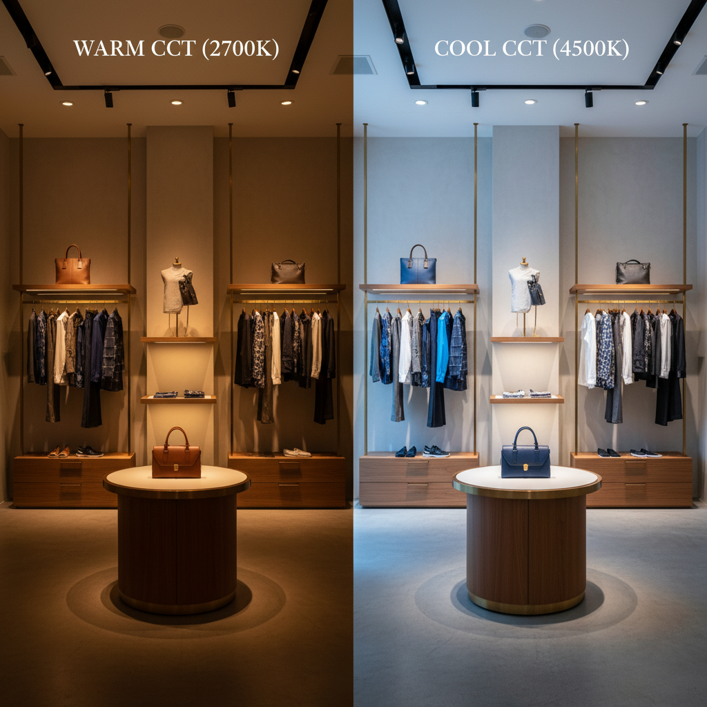
The Emotional Thermostat: How Color Temperature (CCT) Affects Customer Mood
This is where the technical becomes emotional. Color Temperature (CCT), measured in Kelvin (K), isn’t just “warm” or “cool” light; it’s the emotional thermostat for your entire space.
It directly addresses the question of How color temperature affects mood.
- Warm Light (<3000K): This is the light of a candle or a sunset. It’s calming, intimate, and luxurious. It encourages people to slow down, relax, and linger.
- Neutral Light (3500K-4500K): This is the light of a bright afternoon. It’s clean, active, and modern. It renders colors accurately and creates a feeling of energy.
- Cool Light (>5000K): This is the light of a crisp, clear day. It’s alerting, high-tech, and precise. It’s often used to convey a sense of clinical precision or cutting-edge technology.
The Best color temperature for retail depends entirely on your brand’s story. Here’s a simple guide:
| CCT Range | Vibe / Emotional Impact | Brand Story / Narrative | Ideal For (Retail Niche) |
| < 3000K | Cozy, Luxurious, Intimate | “Relax,” “Heritage,” “Exclusive” | Luxury boutiques, high-end jewelry, intimate dining |
| 3500K – 4500K | Neutral, Clean, Active | “Modern,” “Efficient,” “Fresh” | Fashion apparel, modern electronics, gallery spaces |
| > 5000K | Crisp, Alert, High-Tech | “Clinical,” “Precision,” “Future” | Athletic wear, tech stores, pharmacies |
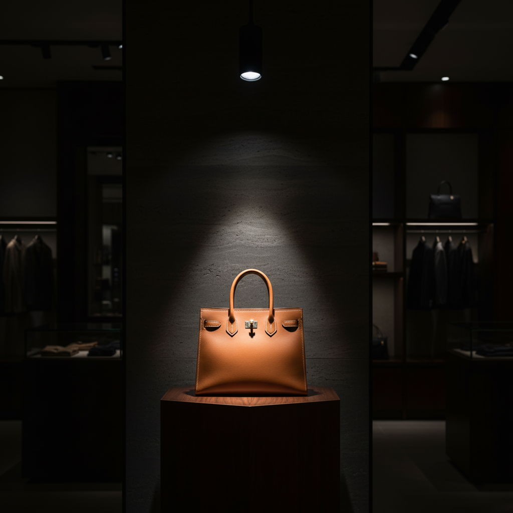
The Art of Focus: Mastering Retail Display Lighting to Create “Hero” Moments
If CCT sets the mood, then light layering creates the focus.
A common mistake in Store Lighting Design is “flat” lighting—making everything equally bright. If everything is emphasized, then nothing is.
Strategic Retail display lighting guides your customer’s eye, creates a visual journey, and turns products into “heroes.” This is achieved through light layering:
- Accent Lighting (Spots): This is your “hero” light. It’s a high-contrast spotlight (often 3-5 times brighter than the surrounding area) that draws the eye directly to a key product, mannequin, or display. This is essential for effective Store window lighting.
- Wall Washing (Floods): This is using soft, even light on vertical surfaces. It makes a space feel larger, brighter, and more open. It also serves as the “canvas” to highlight your brand’s message or art.
- Ambient Lighting: This is the general, “fill” light that provides overall illumination for comfort and safety. This is the base layer upon which you add your mood (CCT) and focus (accent).
The magic isn’t in any one of these layers; it’s in the contrast and balance between them.
Beyond Fixtures: How Light Texture Interacts with Your Store’s Materials
This is the advanced concept that separates good lighting from truly great lighting. This is where a Shop Lighting Design becomes a true art form.
We need to consider the texture of light itself—is it “hard” or “soft”?
- Hard Light (from a small, single-point source, like a spotlight) creates sharp shadows, high contrast, and brings out the texture.
- Soft Light (from a large, diffused source, like a light panel or softbox) creates gentle shadows, low contrast, and smooths surfaces.
Now, think about How light interacts with materials:
- Example 1: Brushed Metal. Hit a sheet of brushed steel with a hard, cool (4000K) spotlight. It gleams. The light emphasizes the metallic texture, and the CCT reinforces the “high-tech, precise” story.
- Example 2: Reclaimed Wood. Hit a rough, wooden wall with a soft, warm (2700K) wash. The light melts into the grain, the CCT brings out the wood’s warmth, and the softness of the light creates a “cozy, authentic” story.
If you reverse those (hard light on wood, soft light on metal), the story breaks. The wood looks flat and dead; the metal looks dull. Your light texture must enhance your physical materials to tell one cohesive brand story.
Conclusion: Stop Just Lighting, Start Storytelling
Your lighting is the most critical and cost-effective tool you have to transform a physical space into an emotional brand experience.
By shifting your perspective from “illumination” to “narrative,” you can create a store that doesn’t just hold products, but tells a story.
Here are the key takeaways:
- Your Retail Lighting Design is a powerful, silent storyteller for your brand.
- CCT (Color Temperature) is your primary tool for setting the store’s emotional tone.
- Strategic Retail display lighting (light layering) creates focus, guides customers, and turns products into “heroes.”
- The best lighting interacts with your store’s physical materials to tell one cohesive brand story.
Is your store’s lighting telling the right story? If you’re ready to elevate your Commercial Lighting Design from functional to narrative, contact our experts today for a free consultation.
FAQ: Quick Answers on Retail Lighting and Brand Identity
- Q1: What is the main difference between Retail Lighting Design and Commercial Lighting Design?
- A: Commercial Lighting Design is the broad category for all business spaces (offices, warehouses, etc.). Retail Lighting Design is a highly specialized subset of it, focusing specifically on customer psychology, brand identity, visual merchandising, and driving sales.
- Q2: What is the best color temperature (CCT) for a retail store?
- A: There is no single “best” CCT. It’s a strategic choice that must align with your brand story. Luxury brands often use warm light (<3000K) to feel exclusive and relaxing, while athletic or tech brands use neutral-to-cool light (4000K+) to feel modern, clean, and energetic.
- Q3: How does lighting affect retail sales?
- A: Strategic lighting directly impacts sales in several ways. It can: 1) Increase customer “dwell time” by creating a comfortable atmosphere. 2) Guide customers to high-margin products using accent lighting. 3) Improve brand perception, which builds trust and loyalty.
- Q4: What’s more important: CCT (Color Temp) or CRI (Color Rendering Index)?
- A: They do different jobs, and both are critical. CCT (Color Temperature) sets the mood (cozy vs. energetic). CRI (Color Rendering Index) ensures product accuracy (how true-to-life colors appear). For any retail store selling physical goods (especially fashion, food, or cosmetics), a high CRI (90+) is essential. It’s a key part of brand honesty—ensuring the product a customer sees is the same product they see outside.


